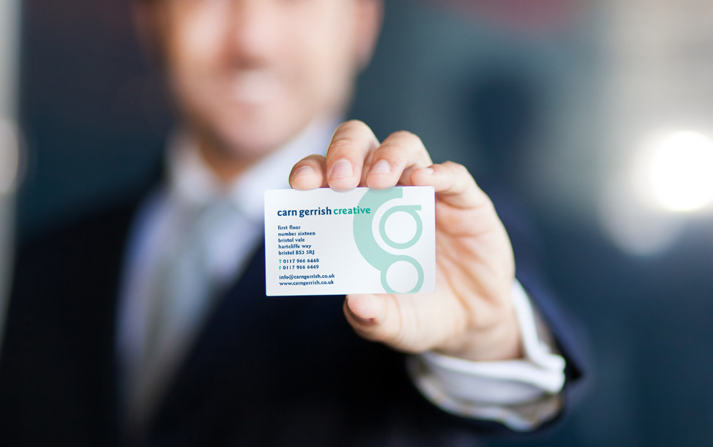
While the development of the internet and social platforms play key roles in connecting the business world, a well-designed business card still makes a huge difference when making connections and seeking new opportunities. On the other hand, a poorly-designed business card can significantly hinder all of your networking efforts.
Creating a highly-effective business card design is much harder than you may think. Professional designers leverage their experience and knowledge of design principles to develop great business card designs. Many also follow these “rules” throughout the design process.
K-I-S-S
While the phrase “keep it simple stupid” might be overused, it definitely applies to the process of business card design. Historically, businessmen would invest a lot of effort into getting as much information as they could onto their business cards. They would fill every square centimetre with colours, logos and text. However, the most successful business cards of today are typically open and clean with just enough information to relay the intended message.
When it comes to modern business cards, clutter is distracting, old-fashioned and even unprofessional. Visually-sophisticated, clean designs create a much larger impact and help your prospects remember you. Focus on putting only the most important information on your business cards, and don’t be afraid to use both sides if necessary!
Remember Me!
If you can find the budget for it, paying a little more for a card design that your prospects and clients won’t forget is well worth it. Whether you use an unorthodox material, a unique texture, an odd shape or letterpress text, presenting a business card that stands out can spark conversations and result in amazing opportunities.
It’s All About the Brand
You could create the most unusual and memorable business card ever designed, but if the card doesn’t match your brand, it may actually cause more negative effects than positive. The design elements used on your business card design should complement the ideas and images you want your company to represent. Choosing random colours or materials is the wrong way to develop a great design. Make sure your company’s brand image is at the centre of the design process and remember, as with many other branding techniques, consistency is key!
Know Your Limits
The worst thing you can do for your business cards is to try to implement some crazy idea that you have no idea how to portray. People can tell when someone has been “trying too hard” on a business card design that just turns out to look unprofessional. If you are hiring a professional designer, know your budget going in and work with the designer to get the most for your money.
If you do decide to take the DIY path, don’t go too crazy with the design. Stay away from vibrant, multi-colour designs and whimsical typefaces. Make your business cards simply professional, and focus on conveying the exact message you need to convey.
Business cards turn forgettable conversations into opportunities for you and your business. Get the design right, and you will be reaping the benefits!


Leave A Comment
You must be logged in to post a comment.