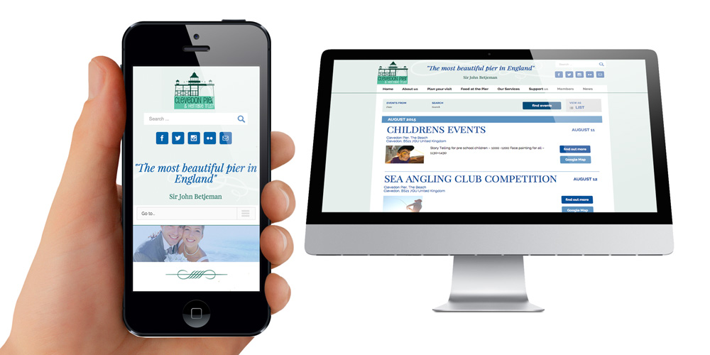
We have mentioned before on how important it is to have a mobile friendly website. But what does that mean?
Around 75 percent of adults use two or more devices—computers, tablets, smartphones—to search online, and will often visit the same page from all of those devices.
Not only do Google and other search engines give priority to websites that are mobile friendly, but once someone finds your website on their smartphone or tablet they need to be able to navigate. If your website appears distorted, unorganised, or if the print is tiny on a mobile device, visitors will leave, and you lose potential business.
Consumers expect your site to be mobile friendly.
Someone else’s shoes
You have spent the time to create high-quality content on your website. Good job.
Now take some time, or perhaps even do extensive research, to determine exactly what content your potential customers will be seeking when on mobile devices. Put yourself in their shoes. What are they likely searching for if they access your site from a mobile device?
Typically people are not doing looking for in-depth information on mobile devices. They are looking for quick answers, entertainment, easy purchases and other simple information.
Does your website make this information easy to find? Can someone purchase your products or find your blog posts or videos with just a few simple clicks?
Templates for success
If you build and manage your own website, choose a template within your content management system (CMS) that uses what’s called Responsive Web Design (RWD). Your template should have the ability to adjust the content on your website depending on what sort of device the visitor is using.
If your template is responsive, the same content will appear in slightly different formats on different devices. For example, your navigation bar may appear on the left side of your website when accessed form a computer, but it is condensed and moves to the top of the page when accessed from a smartphone.
Especially if you are using a common CMS such as WordPress, the CMS will clearly indicate whether or not a template is mobile friendly.
Start with your most important content—your contact information, purchase pages for your most important products, your “About Us” page, etc.
If you are working with a web designer, they should already be aware of the importance of mobile access, but make sure that you emphasise this is a priority for your business. You should work together to map out the typical experience you want your customers to have, as you will have a better understanding of what your customers are like.
Whether working with a designer or on your own, do not set up your mobile website to operate under a different URL. Spend the extra time and money to map out a website that can serve the dynamic needs of customers using different devices. In most cases, this can be done simply and for free by choosing an appropriate RWD-enabled template.

