When it comes to finding the best approach for designing a great landing page, you can find a wide array of different ideas and techniques on the web. However, all of the most effective landing pages focus on the way the audience interacts with each element and the design as a whole.
A good landing page is similar to a perfectly-tuned sales pitch. Depending on the site’s primary objective, it can represent almost anything, but the intent of the page always remains the same. Every small detail on it should work together in an effort to convince the target audience to convert. While that may seem like a complicated task, once you break it down into each element, you can see how strategies can be implemented effectively.
Every professional designer has his own process for creating an effective design, but there are a few simple steps that anyone designing a landing page should follow. This quick checklist offers some ideas and tactics that benefit almost any landing page.
The Perfect Headline
The headline of your landing page may be the most important element of the design. For a headline to be perfect, it must combine the “Four U’s” : Usefulness, Uniqueness, Urgency and Ultra-Specificity. It is almost impossible to meet all four of these requirements completely, professional designers always shoot for at least two of the four.
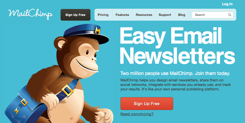
For example, take a look at MailChimp’s headline: “Easy Email Newsletters.” While this headline may not be urgent or particularly unique, it is both specific and useful. Urgency and uniqueness are less important to the specific target audience of this landing page. MailChimp isn’t trying to hard sell concert tickets to its customers, its promoting a service to make life simpler. A great headline doesn’t have to offer all of the “Four U’s.” By meeting two or three of these characteristics, it can still be effective at promoting your products or services.
Highlighting Visual Hierarchy
Visual hierarchy is another extremely important piece to an effective landing page design. If you want to make a solid statement, all of your visual elements must be as coherent as your text content. Your landing page should be arranged so that the viewer’s eye moves from selling points to you call-to-action without distraction. Professional designers often turn to variations in type sizes and colours as tools for designing a compelling visual hierarchy.
Keep Your Copy Concise and Engaging
It may seem obvious that any copy on a landing page must be as appealing, clear and simple as possible. However, most don’t know how bad it can be when a landing page’s text content simply explains how great a company and its products are. All landing page content should be more engaging than these explanations. It should instead focus on describing exactly how the company’s products and services can benefit the target user.
There are many more important steps and elements involved with designing a great landing page, but the goal should always be the same. Bring your target customers in through engaging designs, an effective structure and solid content. Once you have a landing page you think might work, work with your professional designer to start testing and tweaking it until you have the best design possible.



Leave A Comment
You must be logged in to post a comment.