In an age where the average user visits a website for less than a minute, time is of the essence to impart a lasting impression and defeat arguably the number one killer of companies: obscurity. Designing the “right” logo for a business is not a novel concept but executed properly, this facet of your marketing strategy can lead to significant traffic for your company.
Focus on these tips to develop a design that not only visually captures the spirit of your company but also projects a stronger memorability and timeliness.
Simplicity > Complexity
What is the best advice for presenting any new material? Great question. “Keep it simple, stupid”, a quote fondly dubbed KISS, is a phenomenal methodology in conveying fresh information. Frankly, a complicated logo is very challenging to identify in a sea of advertisements. Focusing on a clean and uncluttered design is crucial to enhancing your brand’s memorability, especially during the time sensitive window when a customer first comes in contact with your logo.
Colour…is your logo eliciting the right emotions?
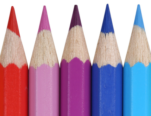
Did you know there is actually a legitimate science behind colour schemes? Humans are tremendously impressionable to the point that if a business wants to evoke a particular emotion it simply needs to lay subtle cues in the colour scheme. During the design process, spend time pondering what feelings your business wants to induce.
Are you in the lingerie product line? Consider using tones of red to portray a bold, sexy character. Work in the financial market? Perhaps a shade of green or blue will display a trustworthy and professional demeanour. Bottom line, research the array of emotions associated to each colour and master the science behind ROYGBIV.
Versatility is crucial
Remember that logos are no longer just signs suspended outside the company headquarters. Expect to do more than simply print this symbol on the front of magazines and flyers. Logos are everywhere and are accessible by nearly everyone on the planet. This obviously ranges from physically printed documents to digital devices to smatterings across social media.
With this in mind, reflect on how the logo will be utilised for advertising in the future and apply design considerations accordingly. Run through every possible permutation ensuring the design is malleable to each scenario without sacrificing value.
Here is a short list of common advertising possibilities to get the juices flowing:
- Clothing: T-shirts, caps, wristbands
- Size: Large and small
- Backgrounds: Range between extremes (black to white)
- Writing: Banners, flyers, display signs
Take it to the board
One of the best techniques to generating creative and effective designs is simply brainstorming a large assortment of possibilities. For a moment, gather the design team (or just yourself!) and allow all prospects fifteen minutes of fame. Write every idea down. Yes, that means the good, the bad, and the horrendously ugly.
This design methodology is rather common in business yet extremely powerful. Instead of eliminating candidates at first blush, this provides an environment for a design idea to grow, expand, and perhaps even combine with other ideas. Don’t sell an idea short until it has been fully investigated! Remember…NIKE is only a checkmark.

