Anyone who has ever done a graphic design project has experienced the principle of emphasis. On the first draft, it looks like the heading needs to be bigger. On the second draft, the heading now makes the logo look too small by comparison. Then, on the third draft, the heading and logo look great, but the call-to-action element is too small to attract enough attention. If you make the call-to-action element larger, then the heading may, once again, seem too small.
Even if you could emphasise every part of the design, wouldn’t that defeat the point? In order for one element to stand out, another must stay in the background. Professional designers use basic techniques such as dominance, points of focus and hierarchy to accomplish emphasis correctly.
Dominance
In any design, two separate elements are either completely equal, or one element exerts a level of dominance over the other. The dominant element will always attract the viewer’s eye first and may even seem to exhibit control over the subordinate element.
To establish dominance, designers give one element noticeable more visual weight than another. There are many ways to set visual weights between elements such as size, colour, shape, depth, density, texture and more. Although it is feasible to include two, most great designs feature only one dominant element. This single dominant element serves as the starting point for the message the designer is trying to tell. Without it, viewers must work harder to find the starting point to your message and may decide to give up and move on.
Points of Focus
While it is best to have one element dominate all others, it is also important to use a lower level of dominance for other elements in a design. These elements represent the points of focus in a design. They capture and hold the attention of the viewer.
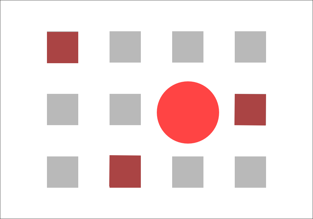
In the above example, you can see that the red circle represents the dominant element, while the darker red squares serve as the points of focus.
Hierarchy
As you create difference levels of dominance with points of focus, you begin to establish a visual hierarchy within the design. This visual hierarchy should match the conceptual hierarchy of the content, and it should be based on the true priorities of the information at hand.
The visual hierarchy allows viewers to scan the design’s information so that its message can me communicated quickly and effectively. The element at the top of the hierarchy, the dominant element, should answer some of the questions a viewer may have immediately upon seeing the design. The best visual hierarchies allow viewers to pick up key points and understand the main message in a matter of seconds. If the visitor is engaged by this initial information, he or she will continue to scan through the points of focus until the complete message is communicated.
Graphic design is all about communicating a message. The best designs grab the viewer’s attention and relay information in a pleasing way so that the viewer engages with the ideas. Emphasis plays an essential role in this fundamental process.


Leave A Comment
You must be logged in to post a comment.