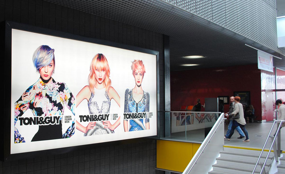
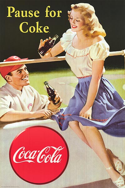
Organisations create posters for a variety of different reasons, but all poster designs must engage the target audience, clearly convey the right information and appeal to the aesthetic interests of that audience. For beginners and business owners, designing a poster with no professional guidance is simply a bad idea. However, these pro tips can give you an idea on what goes into a great poster design.
Focus on Your Message
While an average person may start the poster design process by actually sketching designs and testing colour schemes, a professional designer knows that there must be a clear idea or message for the project before they begin. All great posters start with one solid message. The design of the poster simply allows that message to be more clearly-communicated and engaging to the target audience.
Build Power with the Details
For professional designers, the details represent all of the typography selections, colour choices, layout options and more. These details build the power of the message and create the style, or tone, for the poster. Typography is extremely important to both the clarity of the message and the emotional connection the message invokes. Many professional designers utilize custom fonts to help their poster designs stand out among the masses of competition.
Colour choices, however, may be the most essential detail in the design process. One colour can cause very different emotional reactions between two audiences. A professional designer must match cultural patterns and consumer behaviours to the identity of the brand and message to invoke the intended response. Great colour choices play a major role in the connection a target audience may or may not feel with a poster.
Learn the Importance of Balance
Problems with composition balance often represent the biggest and most noticeable differences between professional and novice poster designs. Professional designers understand how the human eye will move around a design and build a composition around that knowledge. Balancing a complete design can be harder than it seems. Line weights, layouts, colour densities and many other elements must be considered. The use of a grid can help you create balance, but can also limit creativity within a poster design. Great designers know how to stretch the limits of the grid without destroying visual balance.
Take a Break!
Although everyone has deadlines to meet, it takes time to create an effective poster design. Experienced designers will tell you many stories about time when they were under pressure to finish a project and didn’t take a day/night to consider the final design. That situation rarely ends positively. A poster design may look very different the day after you stayed up working on it half the night. The extra time allows the designer to see the poster more clearly, which results in more effective finishing touches and a better final design. Getting feedback from others, especially those that fit in your target audience, can also be extremely helpful.
Organisations place large investments on the success of their poster campaigns. While these tips give you an idea of how the professional process works, finding a professional designer to work on your poster is a better idea. You will get a better return on your overall investment!


Leave A Comment
You must be logged in to post a comment.